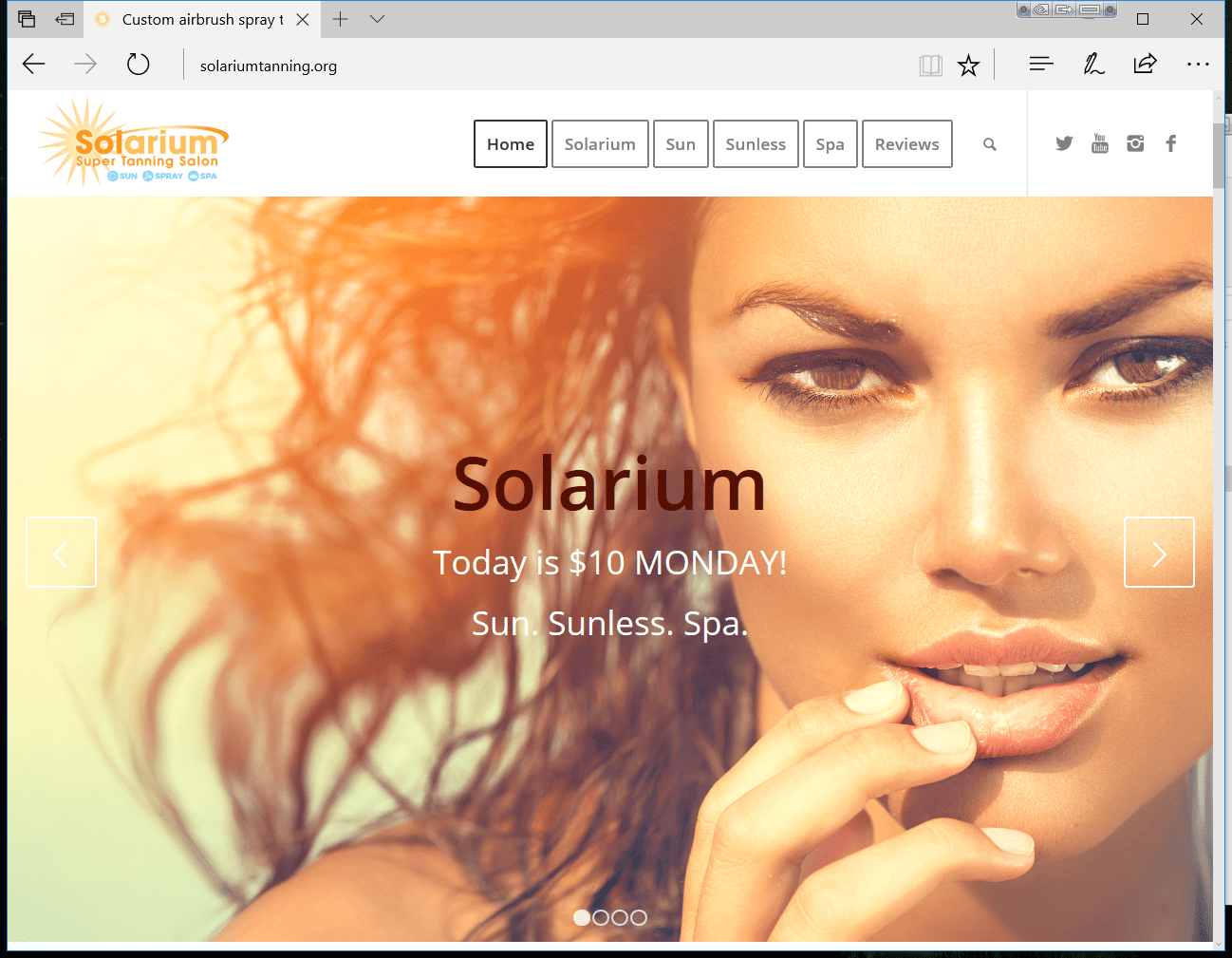
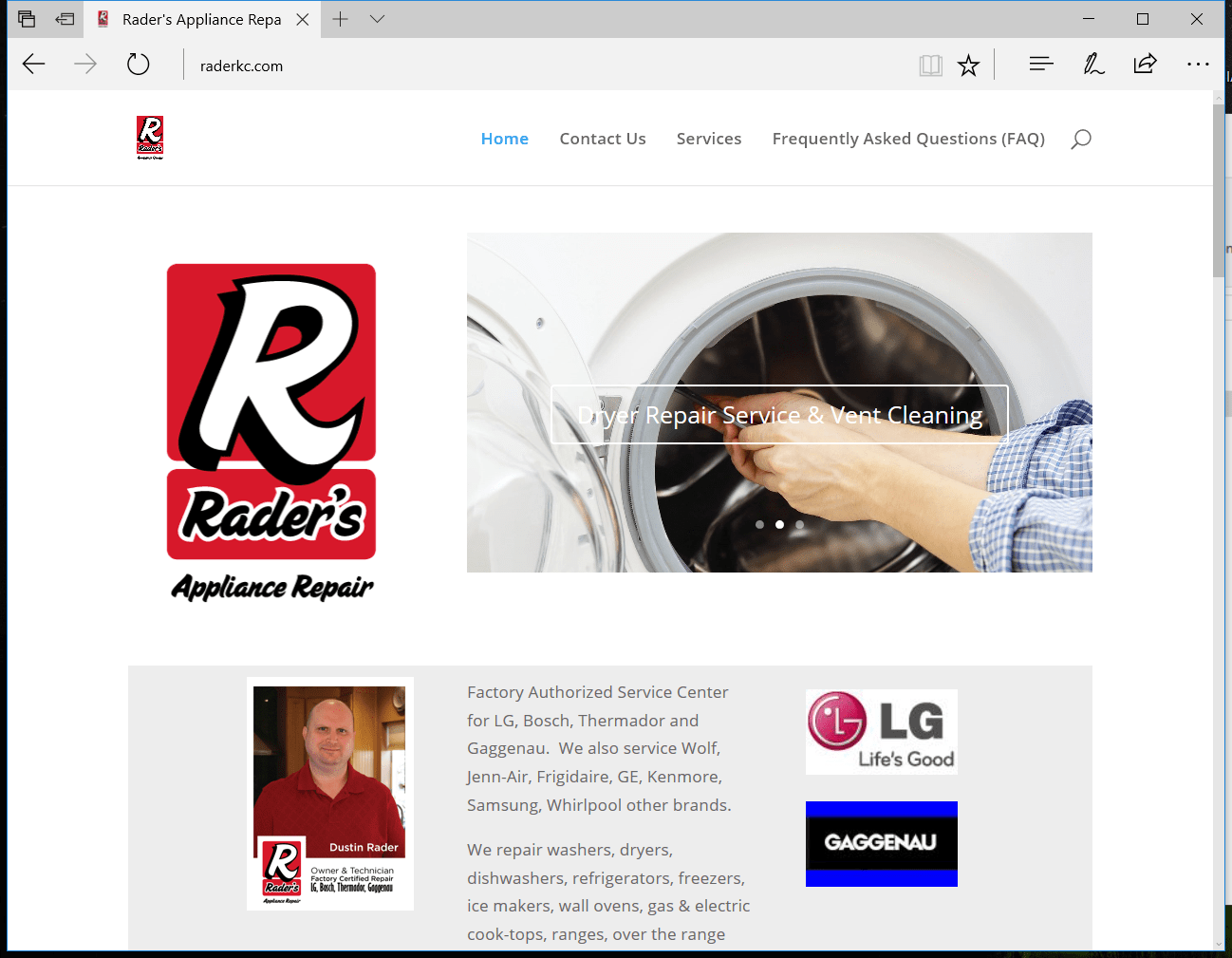
While the wild world of the internet is digital… we think of our designs as being organic!
Websites from a designer and problem solver as passionate about your business as you are.
When we work together, we will set goals specific to branding, business and social media.

Above are all sites created by ProBiz.MEDIA as viewed on a PC or Mac desktop. All designs work beautifully on ipads, tablets and smartphones too.
Our websites employ the latest responsive design, so they adjust for the device.
Smartphone, iPad, PC & Mac


